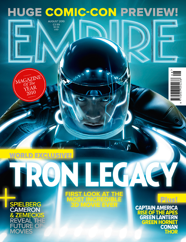
 This magazine cover mainly uses the colour blue as it matches the character but also uses bits of yellow to make some of the text on the cover stand out. I like the way the title of the magazine has been edited to fit the style of the movie. It reminds me of neon signs used on buildings, and the fact that 'Empire' has been changed from red to blue fits the colour scheme. I think that this magazine cover is very eye catching because of how bright it is, it helps convey a futuristic feel across the audience. For my type of trailer I think creating a magazine cover similar to this would fit in with my chosen genre. However, I do like how there is one use of the colour red and it is used to show that the magazine won an award which draws in the attention from the audience but shows them that the magazine is well know.
 Tuesday, 13 December 2016
Magazine Analysis - Empire (Tron)
This magazine cover mainly uses the colour blue as it matches the character but also uses bits of yellow to make some of the text on the cover stand out. I like the way the title of the magazine has been edited to fit the style of the movie. It reminds me of neon signs used on buildings, and the fact that 'Empire' has been changed from red to blue fits the colour scheme. I think that this magazine cover is very eye catching because of how bright it is, it helps convey a futuristic feel across the audience. For my type of trailer I think creating a magazine cover similar to this would fit in with my chosen genre. However, I do like how there is one use of the colour red and it is used to show that the magazine won an award which draws in the attention from the audience but shows them that the magazine is well know. Sunday, 11 December 2016
Poster Colour Scheme Ideas

I really like the two main colours used in this picture as i think they are really strong. I think this is something I'm going to try to achieve in my poster as I really like the exaggerated colours used as I think its more eye catching that the other colour schemes.

I like the black and white effect as I think its really simplistic but bold at the same time. I the black and white style looks very classic but because I want my poster to look very modern I don't think the effect would suit.

I like they fact that the picture uses the normal colour's form the initial picture without any filters as it makes it seem realistic.
Tuesday, 6 December 2016
Font Research


I like this font as I think that it is fairly easy to read but also resembles someone's handwriting well. I think it also seems personal as it is a rather unique font that you would usually come across. However I am not sure if this is a font that I would use on my poster personally.

I like the way that this font even has gaps in some parts of the lettering to further represent handwriting, I think that it is a nice feature. However I think that it could make the title more difficult to read, I also want the title to be quite bold so I don't think this would be the best option.

I think this font represents handwriting well and I also like the fact that it is very bold as I think that makes it easier for the audience to read. However the font reminds me of ones you would find in American diners so I don't think it would be suitable to use on the poster for a 'Coming of Age' movie.

I then decided to layer some of the fonts over the top of images that are currently giving me inspiration for my poster. I think so far my preferred font choice is 'Personality Regular' as I like how bold it is and i think that makes it more eye catching.
Subscribe to:
Comments (Atom)