Wednesday, 30 November 2016
Tuesday, 29 November 2016
Poster Inspiration
I began the process of designing my poster by looking online at others for inspiration, here are a few posters that caught my eye;
 I really liked the way this poster has the block colour of blue layered over the top of the character. This is an aspect that I would like to try and create for my poster. I like how the title is in block capitals and how it is split into three different colours.
 I like the way that the three characters overlapped each other and this is something that I would like to try and recreate in my poster. I also like how it used bright bold colours as I think this is very eye catching. I also like the way the title is in block capitals and is surrounded by a box as I think that this makes the title stand out against the background.
 In this poster I like the way the characters are placed on the poster and how they are looking directly at each other. I think that this tells the audience that they are the central characters in the movie. I also like that the most prominent colour on the poster is pink as it hints to the audience that a romance will develop between the two females. I like the font that the title is in as it looks like a person's handwriting which almost makes it seem more personal, I also think that the yellow used for the title goes really well with the rest of the colour scheme of the poster.
Looking at these posters allowed me to gain ideas for the colour scheme and font that I wanted to use for my Final Poster.
Monday, 28 November 2016
Magazine Inspiration And Design
A possibly magazine I have chosen is 'Little White Lies' as they are a smaller magazine company that advertise a variety of movies. I think that this magazine would be more likely to advertise my coming of age drama rather than a magazine like 'Empire'. I like the way the magazine distorts the colours on the magazine to make it more eye catching to the audience.

 I like the fact that the image is mainly in just two colours as i think this makes the magazine standout as its not very common for magazine to use such bright colours. I think the magazine cover for 'The Neon Demon' is really attention grabbing but I don't think recreating something that would work for my magazine. I could possibly create my poster in the same way as 'Serpico' which would mean i would have a dark background for my cover. However I think that producing a magazine cover like this will not allow me to challenge myself as it is a fairly bare cover as there aren't many headings on show.

 I like the fact that the central image on the magazine covers is the main character, i also like the way the image is quite serious in the majority of the covers. I also like the way that in some of the covers a feature colour is shown through the titles. I think this makes the cover interesting as the central image on the majority of the magazine covers can be quite dark and dull but then the pops of colours make it stand out.

 I like the fact that the image is mainly in just two colours as i think this makes the magazine standout as its not very common for magazine to use such bright colours. I think the magazine cover for 'The Neon Demon' is really attention grabbing but I don't think recreating something that would work for my magazine. I could possibly create my poster in the same way as 'Serpico' which would mean i would have a dark background for my cover. However I think that producing a magazine cover like this will not allow me to challenge myself as it is a fairly bare cover as there aren't many headings on show.
I think another magazine cover I could try and create would be 'Sight and Sound', the magazine advertises a wide range o movies and I think I could create a cover that would suit it.

 I like the fact that the central image on the magazine covers is the main character, i also like the way the image is quite serious in the majority of the covers. I also like the way that in some of the covers a feature colour is shown through the titles. I think this makes the cover interesting as the central image on the majority of the magazine covers can be quite dark and dull but then the pops of colours make it stand out.
I think the magazine im going to take my inspiration from is 'Sight & Sound' as it allows me to use a naturalistic picture of the main character rather than having it have a slightly cartoonist effect like the covers from 'Little White Lies'. I also think that using 'Sight & Sound' will allow me to give across the serious undertone of the movie to the audience.
Tuesday, 22 November 2016
Garageband Progress
 |
In garageband i have been working on little clips of sound which I can place over the top of scenes in my trailer. I haven't decided where they will be placed yet but it is something I will decided once I start collecting footage for my trailer. By creating these clips I have gained a better understanding of the software and how I can edit sound loops to fit together how I want. This will help me at a later date once I start to layer the sound over the top of the edited footage. |
Monday, 21 November 2016
Diary Post 6 Tate Mordern

I want to try and capture some footage from this event as I think it will add to the artsy look i'm trying to create in my trailer. I think it will also help show the audience how the main character in my trailer has strange interests.


I'm going to buy a tripod for my phone to use in the Tate Modern as big tripods are not allowed into the museum.


Wednesday, 16 November 2016
Diary Post 5 Garageband
In todays lesson we began to look at Garageband as its the software that we are using to make the soundtrack to our trailers on. We learned the basics about garage band, we learnt how to use loops and how to over lap them to improve the soundtrack. We also learnt which setting is best to use for dialogue and voice overs.
Monday, 14 November 2016
Locations Research

I want to film part of my trailer in the park to increase the sense of mystery that will revolve around my character. I want to have her exploring throughout the park in a lack of interest to reinforce the idea that she doesn't really care. I will probably shot this at night or at dawn to also help increase the sense of mystery.

I want to film a scene of my trailer in this shopping centre as I think it will help show the audience the age of the characters without having to state it as teenagers are usually scene hanging out in malls.
I'm going to film another part of my trailer at a party as I want to genuinely capture what teenagers are like. I want it to show thew audience the wild side to teenagers without it being staged.

I plan to film part of my trailer near a busy road or on an over pass bridge. I want to use this location as I think it would create enigma codes for the audience as they would be questioning why the character is on the bridge.

I want to try and create a party scene that resembles this picture. I'm going to try and film at my friends upcoming party as I think this will be the best chance for me to try and create something like this.
Poster Analysis - Closet Monster (2015)
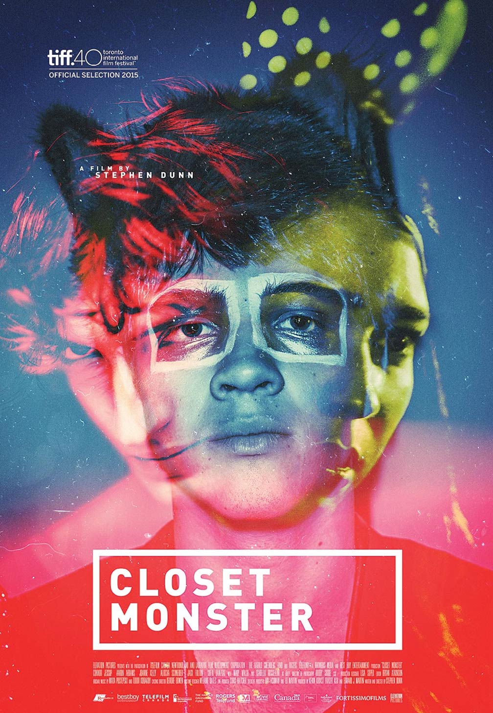
I like the way that the title is presented the fact that it's in white block capitals surrounded by a box makes it stand out against the bright background colours.
After analysing this poster I think I will use some of the features shown when creating my Poster to make it more engaging to the audience.
Wednesday, 9 November 2016
Intertitles Analysis
I chose to look at 'The Perks of Being a Wallflower' for my intertitles as its a coming of age drama.

 I like the background colour for the inter titles as its very bright and eye catching as its a very in your face colour.
 I like the font used as it links in with the fact that a recognisable and significant prop is a type writer for the main character.
In the inter titles the names of the main characters are shown and a the audience is shown footage of the characters afterwards which allows the audience to begin to form attachments.


Monday, 7 November 2016
Trailer Analysis - Juno (2007)
When we are first introduced to Juno she is shown using a burger phone, which shows the imaturity of her even though she is in a serious situation for her age group. The bedroom which she is shown in has posters plastered all over the walls which helps convey her age to the audience as a adult rooms are normally shown as being simplistic and organised. The lack of stereotypical girly colours help show that Juno is not a normal teenage girl as she doesnt fit into the stereotype of girls her age.
On the other hand when the trailer cuts to he rfrined on the phone we are shown her bedroom. She also has posters on her walls but they are of men and her room is a pink colour. This suggests that she fits into the mainstream society for teenage girls. The friend comes across as stereotypically girly as she is shown wearing a tight vest top compaired to Juno who is shown in over sized sweaters.
When the inter titles are shown in the trailer the background is a bright vibrant colour which implies that it is a comical movie. The energetic colour could also help give the audience an insight about the characters personalities.
Juno's parents are presented as being laid back and casual as they are shown in comfortable clothing.
Looking at Juno allowed me to see how a comedic Coming of Age is presented to an audience, This is something that I will reflect on when creating my trailer so I know what will be appropriate to include.
Subscribe to:
Comments (Atom)