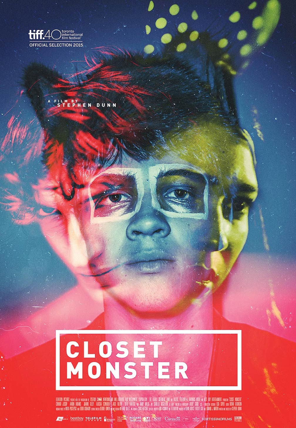
I think this poster is very engaging to an audience as it has lots of elements to it. I like the way the colours work on the poster as they clash but at the same time complement each other. I also like the way the poster features three characters which hints to the audience that they are the main focus in the film. The way each character has a specific colour could suggest something about their personality. The character with the red filter could be viewed as threatening and dangerous. The character with the blue filter could be seen as calm and collected, this character is also the only one who isn't faded which might mean he is the main character in the film. All the characters featured on the front of the page overlap each other this could suggest that they are all linked in some way.
I like the way that the title is presented the fact that it's in white block capitals surrounded by a box makes it stand out against the bright background colours.
After analysing this poster I think I will use some of the features shown when creating my Poster to make it more engaging to the audience.
No comments:
Post a Comment