
Monday, 24 April 2017
Evaluation Task 2: How effective is the combination of your main product and your ancillary texts?
I have created a theatrical trailer, poster and magazine cover that work in synergy to help the promotion of my coming of age drama called ‘Paint’. Because all of the media texts are used together to help promote the movie they all had to link together to make it recognisable to the audience.
I used a similar colour scheme throughout my main product and ancillary text to show a link between the products I had created. I chose the colours red, blue and purple as I thought they were bold and stood out against the dark atmosphere of my main product and ancillary texts, the colours also appear throughout my trailer as well. I made sure that when taking the picture that would be used as the central image for magazine to place the actor against a dark background so the colours layered on top would be more noticeable.
I used the same font on all of my products to show that they were all related. I chose a font that was all in capitals to make it stand out. The font is also similar to printed text which was something I noticed was common in all of the movies I looked at. Both my poster and trailer include release dates and social media links which gives the media texts a more professional feel.
Across all three of my products I made sure that my main protagonist was the main focus to ensure that there was a clear link between them. I made sure to use the main character on the poster and magazine as the central image so the audience would relate the two products. To show a struggle through my magazine cover I had the main protagonist not look directly into the camera and in my poster I layered several pictures of the main character to show that there would be an issue with the character.
In both my poster and magazine there is a white paint splatter coming in from the side to show a link to one of the main key focuses in my trailer which is art. My trailer consists of mainly dark shots which creates a tense atmosphere
In both my poster and magazine there is a white paint splatter coming in from the side to show a link to one of the main key focuses in my trailer which is art. My trailer consists of mainly dark shots which creates a tense atmosphere
Tuesday, 21 March 2017
Evaluation Task 1: In what ways does your media product use, develop or challenge forms and conventions of real media products?
In A2 I created a theatrical trailer, poster and magazine for a film called ‘Paint’. I made sure that my trailer followed general conventions by including features such as Film Production Logos, Social Media Links and a Release Date. These are all things that you would expect to see in a trailer and were included in the trailers that I used for inspiration.
My trailer comes under the genre of a Coming of Age drama and tends to follow the conventions rather than challenge them. Coming of Age dramas usually look at the journey the protagonist has to go through in their teenage years to their adulthood. These types of movies usually focus on serious topics and struggles that teenagers have to go through such as depression and drug abuse. This was a convention that I followed in my trailer through the storyline. I used extreme close ups of pills such as ‘Paracetamol’ to convey the idea of drugs and also showed alcohol bottles on a table to show a party environment.
Some Coming of Age dramas focus on the strain on relationships between people, a movie that does this is ‘Perks of Being a Wallflower’. This was a movie that I took inspiration from as it looks at the difficulties of mental illnesses and the struggle of maintain friendships which was a theme I included in my trailer. This was done by showing a text conversation on a phone between the protagonist and another character using a close up on a phone screen.
Part of my footage from my trailer was taken in school and other parts from central London, I used these locations as I thought that they would be relatable environments for teenagers which are the target audience for my trailer. I shot the majority of my footage at night to help create a mysterious atmosphere for my trailer, the clips I used of London where shot once it got dark to help convey the idea of a busy night life. I intertwined the use of shots with bright lighting and dark lighting to show that there will be a journey made by the main character that isn’t straight forward.
For the soundtrack that I created for my trailer I took inspiration from the Netflix Original programme ‘Stranger Things’. I really liked the mysterious feeling that it gives off so I tried recreating something similar to it. As ‘Stranger Things’ is set in the 80’s I tried to implement that into my soundtrack as I thought that it fitted the footage really well even if the sound was a bit dated. I think because of beat used I think it gave the trailer a bit of tension and suspense. I also include some voice over snippets to help bring a bit of clarity to the storyline, voice overs are used frequently in trailer to help the audience understand the plot of the movie more.
In my trailer I had my character wear normal clothing to convey the idea that the struggles that the main protagonist goes through can happen to anyone. I think this helped the storyline become more relatable as the audience could see themselves being represented in the main character and therefore would relate to the scenarios more.
I chose to call my trailer ‘Paint’ as the majority of my trailer storyline revolves around artwork. I chose the title as I think it’s quite peculiar which I then hope will grab the audience’s attention. I think the title hints to what a main theme of my trailer will be which is something I wanted to happen as I think it will engage the audience and make them wonder how it will all relate.
The main use of my intertitles was to help the audience understand the narrative of my trailer. This conforms to the conventions of coming of age dramas as they use intertitles to introduce characters and convey the plot to the audience. I took inspiration from the intertitles from ‘Perks of Being a Wallflower’ , by having them look fairly simple but hint at the plot to the audience. A difference I had was by using a simple colour scheme of black and white for the intertitles as my trailer is dimly light throughout the majority of the scenes therefore i thought it would fit better with the overall feel of my trailer.

Magazine

For my magazine my first intention was to create a ‘Sound and Sound’ magazine but after receiving feedback after uploading my first draft saying that ‘The image used for the magazine doesn’t fit in with the feel of the trailer and magazine’ I looked into the company ‘Little White Lies’. I found that it had a more artistic feel rather than movie magazines such as ‘Empire’ and ‘Total Film’ and i thought that this was necessary as my trailer surrounds artwork and bright colours therefore I concluded that ‘Little White Lies’ was better suited.
All of the magazine covers for ‘Little White Lies’ have a lot of graphics and artistic aspects but don’t follow the usual conventions of magazines when it comes to additional features such barcodes and puffs. The magazine covers mainly focus mainly on the design of the central image. Therefore I spent a lot of time editing my picture to make it bright and eye catching. Using several layers on photoshop i spent time editing each of the colours of the paint strokes. I wanted the colours to resemble a bright version of the colours i used for my poster. I achieved this by using the ‘Hue/Saturation’ tool on the software to increase the saturation and lightness of the colours. I also used another layer to place the white ink splatters on top. I did this as it’s a feature i also include on my trailers poster. I did this to make it more obvious to the audience that there is a clear and distinct link between the products.
Poster
When creating my poster I looked at the posters for the movies ‘Closet Monster’ and ‘Moonlight’ as they both had a similar style that I wanted to recreate for my poster. I took the idea of overlayer a character that’s slightly faded from the ‘Closet Monster’ but I changed the colour scheme to one that I thought was more suited to my trailer. I wanted my poster to have a softer feel but at the same time also produce enigma codes that make the audience question things about the main protagonist.
I tried to have the title stand out so I put it in white colouring and Black faded into the main image to much whereas I think the white is quite eye catching. I also had the font resemble simple typing as I found that it was a common in the other posters that I took inspiration from. In the ‘Moonlight’ poster the title has an effect over it that makes it seem to glow almost and in the ‘Closet Monster’ poster there is a box surrounding the title which relates to the image of the main protagonist who also has boxes around his eyes. For my title to make it slightly different I had the letter of the Title be more spaced out and not bolded and have white ink splattered along the side.
On my poster I followed conventions of normal poster by including star ratings, because my trailer is for an independent film I thought that the ‘Sundance Film Festival’ award logo would be suitable for my poster. Along the top of my poster I included the name of the actor that plays my main character, I made sure to use the same font as my main title to make the look of my poster more consistent.


![institution logo].png](https://lh6.googleusercontent.com/kANkbjD0kBMDj1m_lL6rUitU2V8RDU-vj8CsgubMbT3L4I7z_NWTS1EAhSAaDcngUAkneCCcEgjauT25Jv7LKnu2Eufmrs4CaIubUIXnjrnt9TNI4NAdJ06Axv3tz6j_4d5fXDeh)

Tuesday, 14 March 2017

Monday, 13 March 2017

Wednesday, 22 February 2017
Magazine Third Draft

This is the final version of my magazine, I kept the paint brush strokes as it relates to one of the main aspects of my trailer. However, I changed the colour of the paint strokes so that they make the bright colours on my poster more. I did this by manipulating the same image using the 'Hue and Saturation' tool on Photoshop. This meant that I didn't have to individually find the right colour of each paint stroke but could use just one and adapt it to the colour I wanted.
Tuesday, 21 February 2017
Intertitle Inspiration
hello and I'm sorry
a salutation and a farewell
I don't have much time
this times new roman will fly from my fingertips like the skin of a cicada
the black hollow letter shells
this people are filthy, disgusting,
ruled by the power of exchange of sex from the proletariat to the bourgeoisie
the place is grimy
and the people that dwell In it wake up and wipe the filmy layer off their lukewarm eyes
if this were a movie, id run off into some sort of blood red sunset
but this isn't a movie
these are the badlands
This text is taken from the music artist Halsey's 'Badlands'. This text gave me some inspiration for my inter titles that I included in my trailer.
Magazine Second Draft

For my magazine I really likes the use of the paint brush strokes as I think it makes the image more eye catching and intriguing for the audience. Some feedback I got was to make the colours brighter to make it more obvious that there is a link between my poster and magazine.
Sunday, 12 February 2017
Magazine Change Update

 I decided to change the magazine company as it fits the style of my magazine, poster and trailer. After receiving feedback I decided to change the company because this companies uses more colourful and edited pictures as the central image.

Saturday, 11 February 2017
Poster Second Draft

Friday, 10 February 2017
Poster First Draft Feedback
Poster Draft Feedback
- Add Institutions
- Add Film Title
- Social Media Links
- Include the slogan 'Hook' from trailer.
Thursday, 9 February 2017
Poster First Draft

This is the progress I've made so far on my poster. I began to add the institutions and titles. I also added social media links.
Thursday, 2 February 2017
Magazine First Draft Feedback
Magazine First Draft Feedback
- Try to relate the magazine and poster together using the same colour scheme.
- Possibly try making the font Purple of use a more purple colour over the top.
- Look into 'Little White Lies' as it may suit the style of the trailer more.
- Make the picture more 'Neon' to link all of the products together.
- Think about retaking the picture to make the character more central.
Wednesday, 1 February 2017
Magazine First Draft

This is the first draft of my magazine cover. While making the cover I looked at an actual copy to check if the placements for the 'Title' and 'Barcode' where in the right places. I used 'Adobe Photoshop' to create the image. I used several layers to achieve the colour that is on the original picture, for this I had to learn how to use the 'Gradient Tool'.

Monday, 30 January 2017
Trailer First Draft
This is the First Draft of my Trailer. I really like the way the colours come across in it but there are still several pieces of footage that I want to include as at the moment the trailer portrays the idea that the movie only revolves around one person. To correct this I need to collect more footage of the other character I want to include, and have the two characters interact with each other. I want to try and include more difficult shots such as an arc shot and an aerial shot as I think this will help improve the trailer.
Trailer First Draft Feedback
- Possibly include a POV Shot
- Include Institution Logos
- Maybe have a Voice Over to explain the narrative
- Make the story-line clearer
- Have more footage of art work
- Add footage of the 'Conflict'
After receiving the feedback I began to look for ways to make the narrative of my trailer clearer. I came to the conclusion that I wont have enough time to include an extra character fully, so I decided instead to have the main character receive a text message from an unknown number which then leads to footage from the past of maybe a party scene where a fight breaks out. I think that this would help hint to the audience that something happened in the past which causes the character to then spiral out of control.
Sunday, 29 January 2017
Diary Post 9
I realised when creating my trailer that I wouldn't have enough time to have both of my main protagonists in the footage. This is because neither of them were available at the same time which caused problems. Instead my teacher and I came up with an idea of using a mobile phone as the second character by using that as the way the main protagonist would interact with another character.
Friday, 27 January 2017
Poster Plan


 With my rough draft of my poster I wanted to to stick to the idea of layering images on top of each other to create a mysterious feeling. This inspiration came from the poster for 'Closet Monster'.
 However I decided to use a similar colour scheme as the picture on the left. I thought these were more complementary to each other rather than contrasting and I personally preferred the way it looks.
To create this image I used an app for iPhones recommended to me from a friend. The app was simple to use as all you had to do was drag the selected to the positions you wanted and then alter the colour of each layer.
I might possibly recreate this kind of image but using the same picture as the magazine cover so it is clear to the audience that they are both related to each other.

Wednesday, 25 January 2017
Magazine Plan


I took this picture from my friend as the picture I want to use for my magazine. I liked the way the shadows are across her face as I think this adds as mysterious feel to the character.
 I then add a slight pinkish tint to the picture to make it softer. I really like the way this looks as you can still see the shadows across her face but they don' t come across as harsh. I also think the pinkish tint helps to give the picture a more romantic touch. If I do use this picture then I would have the title on the right hand side so it doesn't block her face. However I think I will try to retake the picture so it includes both of the characters featured in the trailer, so you can see that they are related. I would still include the tint on top as I like the effect it gives. When I edit the picture to become the magazine cover I plan to enhance the colours to make it more eye catching.
Wednesday, 18 January 2017
Diary Post 8
I had to redo my soundtrack work as the sound had stopped working I also decided to take the time to try and match up shots when certain beats play. I think this would have a positive effect on my trailer as I think it would make the trailer more interesting to watch. I also learnt how to fade music in and out so I decided ti use this technique on some of my 'loops' so they flow together better.


Monday, 16 January 2017
Poster Pictures

For my poster I possibly want to recreate something that resembles the 'Closet Monster' teaser poster. I want to use similar colours but instead of having the different characters overlapping I want to use just one. I want to have the character showing different emotions, I think this would show and
audience the struggle the character goes through.

 Another thing I might possibly test out as an option is this softer idea. I really like the picture of the girl with the paint strip across the face. I also like the image where the picture of the person is only visible through the flowers. I think once I take possible pictures of the actors I'm using then I'll be to get a better idea of which would suit better.
Magazine Layout

 I chose for this to be the rough layout for my magazine. I tried to replicate actual copies of the magazine to give me a better understanding of the placement of different images and texts, I think this will be helpful when it comes to creating my magazine as it will allow me to follow a structure.
Thursday, 12 January 2017
Diary Post 7 Editing Update


In this lesson I spent time working on the music for my trailer and editing part of the footage I had together. I started to piece together the footage I had of Viki in London to try and show her exploring around. I then began to create the soundtrack that fits on top of the footage.
Tuesday, 13 December 2016
Magazine Analysis - Empire (Tron)
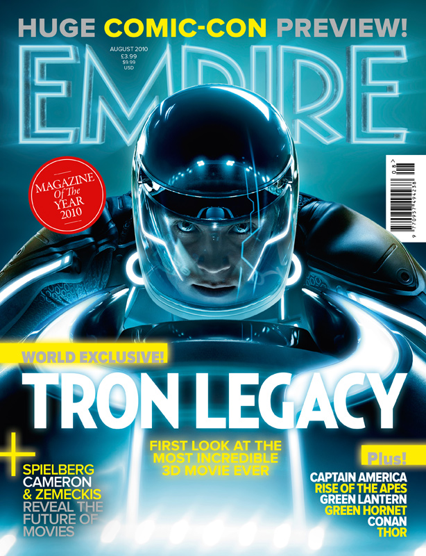 This magazine cover mainly uses the colour blue as it matches the character but also uses bits of yellow to make some of the text on the cover stand out. I like the way the title of the magazine has been edited to fit the style of the movie. It reminds me of neon signs used on buildings, and the fact that 'Empire' has been changed from red to blue fits the colour scheme. I think that this magazine cover is very eye catching because of how bright it is, it helps convey a futuristic feel across the audience. For my type of trailer I think creating a magazine cover similar to this would fit in with my chosen genre. However, I do like how there is one use of the colour red and it is used to show that the magazine won an award which draws in the attention from the audience but shows them that the magazine is well know.
 Sunday, 11 December 2016
Poster Colour Scheme Ideas

I really like the two main colours used in this picture as i think they are really strong. I think this is something I'm going to try to achieve in my poster as I really like the exaggerated colours used as I think its more eye catching that the other colour schemes.

I like the black and white effect as I think its really simplistic but bold at the same time. I the black and white style looks very classic but because I want my poster to look very modern I don't think the effect would suit.

I like they fact that the picture uses the normal colour's form the initial picture without any filters as it makes it seem realistic.
Tuesday, 6 December 2016
Font Research


I like this font as I think that it is fairly easy to read but also resembles someone's handwriting well. I think it also seems personal as it is a rather unique font that you would usually come across. However I am not sure if this is a font that I would use on my poster personally.

I like the way that this font even has gaps in some parts of the lettering to further represent handwriting, I think that it is a nice feature. However I think that it could make the title more difficult to read, I also want the title to be quite bold so I don't think this would be the best option.

I think this font represents handwriting well and I also like the fact that it is very bold as I think that makes it easier for the audience to read. However the font reminds me of ones you would find in American diners so I don't think it would be suitable to use on the poster for a 'Coming of Age' movie.

I then decided to layer some of the fonts over the top of images that are currently giving me inspiration for my poster. I think so far my preferred font choice is 'Personality Regular' as I like how bold it is and i think that makes it more eye catching.
Wednesday, 30 November 2016
Tuesday, 29 November 2016
Poster Inspiration
I began the process of designing my poster by looking online at others for inspiration, here are a few posters that caught my eye;
 I really liked the way this poster has the block colour of blue layered over the top of the character. This is an aspect that I would like to try and create for my poster. I like how the title is in block capitals and how it is split into three different colours.
 I like the way that the three characters overlapped each other and this is something that I would like to try and recreate in my poster. I also like how it used bright bold colours as I think this is very eye catching. I also like the way the title is in block capitals and is surrounded by a box as I think that this makes the title stand out against the background.
 In this poster I like the way the characters are placed on the poster and how they are looking directly at each other. I think that this tells the audience that they are the central characters in the movie. I also like that the most prominent colour on the poster is pink as it hints to the audience that a romance will develop between the two females. I like the font that the title is in as it looks like a person's handwriting which almost makes it seem more personal, I also think that the yellow used for the title goes really well with the rest of the colour scheme of the poster.
Looking at these posters allowed me to gain ideas for the colour scheme and font that I wanted to use for my Final Poster.
Subscribe to:
Comments (Atom)